Level Up!
Our sequel to Tank 1943. Grinding your way up the ladder with this action-packed Run ‘n Gun shooting game. Gain new skills, new tanks, new maps, new effects, new stuffs as you level up. Let’s see how high you can get!!!
You can play this game at: http://www.newgrounds.com/portal/view/643703

LevelUp! is a sequel that we also put a lot of heart and mind into its production and got a lot of important lessons out of it. However, today I will not talk about the actual designing process, which was very similar to Tank 1943 (If you haven’t played Tank 1943, please visit this portfolio entry to play the game and learn more about its design process!) . I would like to talk about the concept of Game Flow in game design as well as how do we actually try to apply it to LevelUp! a project that is purely based on that concept. Unlike the last time, let’s first begin with how the game actually turned out.
An interesting result
Level Up, as the name might have suggested, is a Run `n Gun tank shooting game in which your goal is to keep destroying enemy tanks in order to keep leveling up, which opens up new items, challenges and elements. We want to create a simple game in which a player can just go right in and start the action. The project started in my first summer in college and once again, we are determined that we can complete the game in 3 months. Unlike the last time, we are much more experienced with Stencyl and more aware of Stencyl web capabilities. All additional features were made in consideration with Stencyl technical shortcomings to ensure that the game runs smoothly on the web. We also learnt a lot from our mistakes in the last game and had a much more efficient process to produce it.
In the end, LevelUp! was completed in just 3 months as we expected. It was produced with much better graphics that Tank 1943, and the entire experience was very smooth (60 FPS all the time in a normal laptop). The game rarely has any visible bug and Khai carefully allocate the memories to ensure that the game doesn’t slow down over time. In terms of technique and graphics, it was a tremendous improvement from our prequel Tank 1943.
Yet, interestingly enough, when we actually publish the game, it has received lower rating than the previous game. While praising our graphics and musics, players slowly lose motivation throughout the game. We based our game on constantly leveling up, as the description might suggest, but it failed to keep our players on the game long enough like other similar games such as Epic Combo or Toss the Turtle do.

What did we do wrong? This result was certainly disappointing for us, who were very confident that this game is better than the prequel. But it was also a great learning opportunity regarding game design. As it turned out, when we try to apply the concept of game flow, we were too focus on applying it strictly and failed to think about it in a more general sense. To understand this, we have to dig deeper into the concept of game flow and how we tried to build around it.
Game flow and the concept of LevelUp!
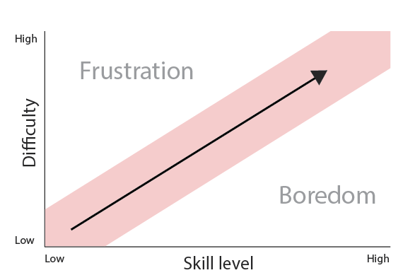
Game flow is one of the classical concept of game design which was actually based on the concept of flow proposed by famous Polish psychologist Mihaly Csikszentmihalyi. The concept specifies how we should progress the game as the player moves forward. In this concept, there are two axes of difficulty and skill. If the game is too easy and the player is too highly skilled, the game gets incredibly boring. Would you like to play Super Mario Bros game if the only challenge is to move to the right on a plain field? On the other hand, if the game is too hard and the player doesn’t have enough skill, they will get too frustrated by the challenge and will simply give up. Thus, there is a Goldilocks region in which the challenge of the game is just right to the skill of the player that he or she will achieve the state of flow. When one achieve the state of flow, by Csikszentmihalyi’s word, time ceases to exist.
Another important thing to note is that game designer should always expect the skill of the player to generally increase overtime. Thus, as the game progress further, the designer has to predict the skill level of the player and design challengers that are harder enough to accompany the rise in skill-level increase.

In Books of Lenses, game designer Jesse Schell pushes this concept even further. He think that if the challenge only gets harder linearly, the gameplay will feel the same all the time, which actually isn’t interesting. He proposed a vibrating flow curve, which states that the level of difficult should actually fluctuate, but will generally stay in the zone until the player meets a very challenging boss. For example, after a period of relatively simple challenges with slow increase in difficulty, the player will suddenly encounter a very hard challenge that forces the player to drastically improve skill level to overcome. Ideally, the player would feel incredibly compelled to actually try their best to overcome the challenges. This challenge will be followed by a period of easier obstacles to make the player feel rewarded for his increase in skills and the process repeats.

This design pattern is very popular. Examples of this would be any game that has different stages of boss, in which the boss acts as the difficult challenge for each cycle. If this is well done, the players can stick to the game for an incredibly long period of time. A great example of this would be Super Mario Bros.
Our flow was too divergent
Our idea was to have three main elements Challenge, Player’s Power and Player’s Skill go hand in hand together as the Level progress. These elements will not increase linearly, but slightly offset from each other to create the interesting flow according to Schell’s diagram.
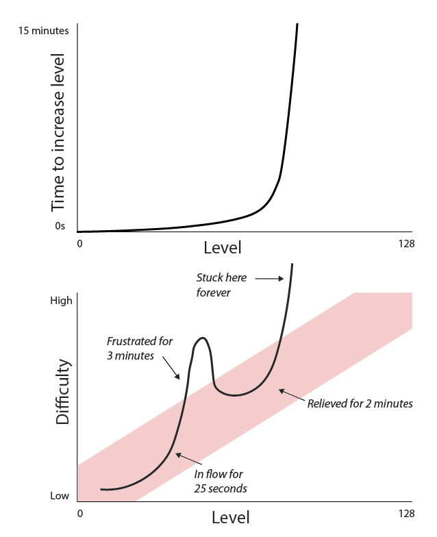
It didn’t turn out that way. The way we increase Player’s Power and the Challenge create a level 35 that was incredibly hard to pass through. You can only increase your XP if you hit an enemy, but because at this level you die from one shot so many users report unable to do anything to progress the game further (they just keep dying and have to reset at level 35).
Level 64 is also a turning point in which the game becomes impossibly hard to play. Each enemy now takes 2 shots to destroy, and there are now 6 of them constantly chasing your tank and you can only take 3 hits. At this point, the game is already unplayable, and the user totally lost control of the game.

You might ask why are these issues so hard to solve? That’s because we set up an overly complicated scheme of many different elements. Before the game goes to testing, it already has so many elements to balance out: Tank’s power, Tanks health, Enemy’s power, enemy’s health, New weapons, etc. Each of them also increase in a non-linear fashion making it really hard to tweak and control the flow. We weren’t even able to balance it after the first week release because it was too difficult.
Users spend the majority of time outside of flow zone
One of the thing that was obstructed from the flow diagram was the time spent on each part of the graph. We did take this into account and simply design the amount of XP needed to earn to be a non-linear square curve. This is a disastrous mistake, because it actually shift the time out of flow zone to be larger than it is supposed to be in our initial design. The user ends up spending more time out of flow than inside the flow channel, and end up forever outside of it.

The fix for this would be to change our design philosophy. We focuses too much on our level as the driving force that controls flow instead of time. And we model our XP level in such a simple fashion that don’t reflect the experience of the player, which ends up hurting the game.
Flow is multi-dimensional
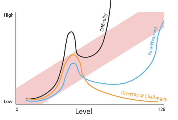
We were so focused on flow between Skill and Challenge that we forgot that flow is actually multi-dimensional. We can have a Reward flow and a Diversity flow which work just like the Difficulty flow in which there are similar 3 zones of Flow, Boredom and Frustration. We were so focused on the Difficulty flow and totally forgot about other elements, which quickly make the game boring. There are only 2 kind of challenges of the game, which are tanks and turrets, and the user don’t have any new weapons to their arsenal. By the time we reach the second flow zone in difficulty, other elements already make the game boring to play.

The importance building rectangular gameplay demo
So why weren’t we able to fix this mistake? That was because we already get too far into the game details that it becomes so increasingly inconvenient to actually make modification. We already knew that gameplay is the most important aspect of the game and design things around it, but our execution contains too many modifiers and there. In the end, we simply aren’t able to make modifications to balance the game.

In retrospect, we could potentially identify this problem earlier by building a game with black-box elements. We once again succumbed to our mistake of initially spending too much time on graphics and 2 months are still too long to produce the first gameplay (We were simply suckers of good graphics!). The black-box game design should only contain the barest possible version of the game so that we don’t create unnecessary modifiers to make our life harder in the long run.
All good things take time
After this game, I went to college while Khai took a gap year. Our distance no longer allows us to work together so we decided to end the project. Both of us are still immensely proud of this effort. We usually joke around a quote in the Book of Lenses by Jesse Schell that “your first ten games will suck.” We already got 2 out of the way with better-than-expected results. We will spend some time apart to build some projects on our own and wait for the right time to collaborate again.
